Herbert Bayer
Herbert Bayer was both a student and a teacher at the Bauhaus and worked with painting, sculpture, typography, advertising and architecture. As a student he studied painting with Kandinsky. He went onto teaching one of the Bauhaus' first classes on typography. Bayer feels that typography is not about you enjoying yourself, its about following the boundaries of type. He feels that there is only one perfect way of communicatimg typographically, you have to find that way.
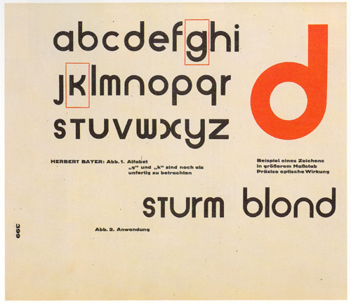
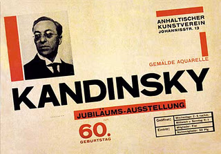
Above are two examples of Herbert Bayer's work. From looking at these two pieces, the use of the grid is evident. With the accurate use of angles, equal spacing and the alignment of the composition.
On Typography written by Herbert Bayer in 1967 goes into describing grids as a way of communicating universally. In addition, he mentions how typography could potentially be improved and he gives his prediction of the future of technology in terms of the reading.
This quote from On typography 'the storage of book will be replaced by microfilms' suggests what Bayer felt would happen in the future. He goes on to talk about how this method of storage would in tern change the design of libraries.
The quote from On typography ' ..."square span" is putting words into thought groups of two or three short lines, such as
typewriters and typesetting machines would have to be adjusted to this method. text written in logical, short thought groups lends itself best. the advantages of grouping words support the theory that we do not read individual letters, but words or phrases. this poses a new challenge for the typographer. text in color black printing on white stock, because of its extreme opposites, is not entirely satisfactory. the eyes forms complementary images. flickering and optical illusions occur, however minimized they may be in a small typeface. they can be reduced if the contrast of black on white is softened by gray printing on white stock; black printing on gray, yellow, light blue, or light green stock; brown, dark green, or dark blue printing on light colored stock.'
The quote illustrates the different ways in which Bayer wants to improve reading in order to increase focus. He speaks grouping words to make reading easier. This method supports the theory that we don't read individual letters, but words or phrases. Looking at his example, I think that the theory is correct as reading the example I found that the text is easier to read and faster. In terms of posing a challenge for the typographer, I think he is referring to the typographer having to change from the traditional way of aligning type to this one. Furthermore, things like typesetting machines would need to be adjusted in order to follow this typographic structure. He then goes onto talk about colour and how it affects our eyes. The colour black on white paper causes our eyes to flicker whereas this can be reduced if the contrast of black on white is changed by another colour being introduced to the stock such as grey etc.
after a
short time
you will
automatically
stop
you will
begin
thinking
confusing
your
sentences
in easily
understood
with
complicated
phrases
groups of
words
and
unneccessary
words
BACK