BACK
Data
[[[ LINKS TO OTHER PAGES ARE IN THE TURQUOISE COLOUR OBJECT BOXES ]]]
Data are typically the results of measurements and can be the basis of graphs, images, or observations of a set of variables. Raw data, i.e., unprocessed data, refers to a collection of numbers, characters, images or other outputs from devices that collect information to convert physical quantities into symbols. There are many different ways in which to represent data is usually referred to as information graphics as they are quite aesthetically simple and pleasing most of the time. Below are some examples of a few ways in which data can be represented:
Drinkable data is represented here. The higher the level of each colour, the higher the percentage of each sector that is represented.
1. Visible Data
Data here is shown using a barcode graph, the width of each bar represents the percentage per sector. The wider the bar, the higher the percentage.
Data here is represented using a data mountain. The colour coded key gives the exact number of money used in each sector of the budget. Whilst the visual represents the numbers, it also illustrates a higher mountain for a higher number.
Project Visible data_financing culture looks at and brings together visual communication, design, technology, new media and culture politics. Using different graphs it helps us to visualise and understand information.
DATA DISPLAY WORKSHOP:
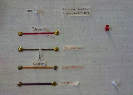
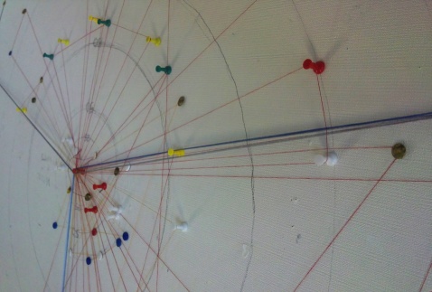
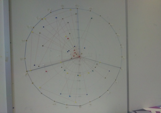
We all tracked the energy values from different rooms in our own houses for 24 hours and wrote down all the data. Working as a group, we focused more on making the visual representation of the data more aesthetically pleasing. We did this by putting pins into the wall to represent the different appliances such as lightbulbs, TVs etc. Then we wrapped our colour coded thread around the entire design for every hour that the appliance had been on for. This created a thicker collection of string which showed a longer use of an appliance and this could be seen when looking at the representation at a side angle. To distinguish each persons energy use, we were all assigned a specific colour string and added our initial tags at the bottom of the string we each used.
The image on the left and above depicts a circular graph with pins plotted by watt of electrical item, by the period of time it was on. This is displayed using the circle as a 24 hour clock, going clockwise. The graph shows all the data collected, but creates some confusion as when looking at it you cant work everything out straight away even after looking at the key. Furthermore, its not very aesthetically pleasing. Whereas, our representation is visually appealing but doesn't represent enough data and doesn't show it clearly. So a good medium between the two representations shown above would be ideal.